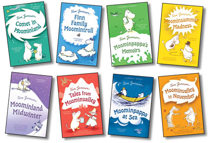
When I was asked to redesign Tove Jansson’s Moomintroll series last summer, I was thrilled. Having lived in Denmark for eight years, I was well aware of Tove Jansson’s status as a treasured Scandinavian author, artist and cartoonist.
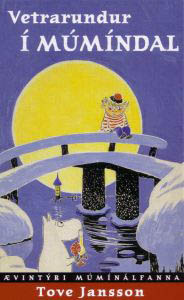
I started by re-reading Comet in Moominland to get a feel for the quirky characters and their adventures in Moominvalley. I also looked at some of the covers of the previously published editions: the Icelandic cover,
the Finnish cover,
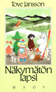
and the French cover.
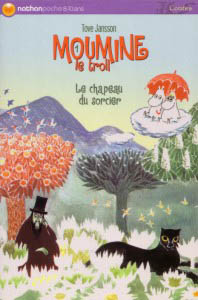
Of course, in addition to the Moomin series, the French have also published a book about Moomin cuisine. Here’s my personal favorite, the Japanese editions:
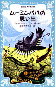
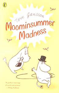
Finally, here is one of the UK books done in 2000 from which we picked up the art and changed the colors. This is what they originally looked like.
Tove Jansson’s books have been published in so many languages, and so many editions around the world, even Esperanto, that I cannot show them all here.
Then the real work began. We were picking up the cover art from the British edition but changed the colors so that they were brighter. I played with them in Photoshop and made them bright…brighter… brightest. Then I found some new type for the title and back panel. I moved a number of elements of the art around in Photoshop so that it would work better with the new back panel layout. And we were able to use spot gloss to highlight the titles and some of the elements on the covers on a matte cover stock, which I think really pushes out the art. What I really love about these are that there is a somewhat monochromatic color scheme on each book—it feels like breaking the rules a little bit, because in children’s books we often want to go for many bright colors together. But in this case that type of color scheme really works to identify these books as being part of a series and belonging together: they look like candy and they make people smile.


