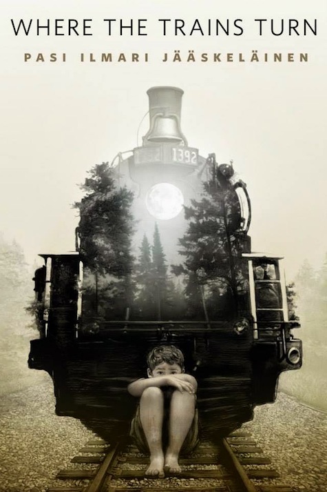
I was approached by Irene Gallo to do a piece for Tor.com’s “Where the Trains Turn” by Pasi Ilmari Jaaskelainen, and as typical to my previous efforts, (and despite my swearings to be cured of this method) I ended up doing two.
Overall I have always railed against this double work as a poor and time consuming way forward. “Why not just thumbnail it first, you dolt?” is the usual refrain when it comes to confessing this as a recurring event. And I thought for a while that it was true. That my impatience to get right to the piece itself was causing this. But as it turns out, this is not the case. So, I have decided to hug this as a legitimate part of the process, and celebrate its necessity rather than try and undo it. So, in full confession mode, here’s the deal as representative of deals to come and deals long past, and why it’s maybe not such a bad thing.
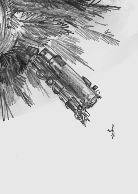
So since this was assignment was also coupled with a second piece for another Cabal installment, and we were in the height and heat of vacation time, I thought sketching an initial notion out would be the best way to make sure I wasn’t entirely lost. Really this is the normal way of things, but for Irene and myself, it stood in for my usual approach to either provide a written concept before charging into the final, or simple just going whole hog into the endgame. Sometimes this nailed it right off the bat, other times… well it just didn’t.
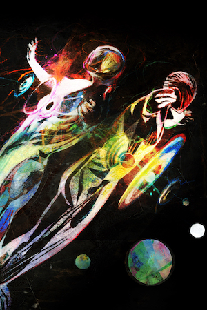
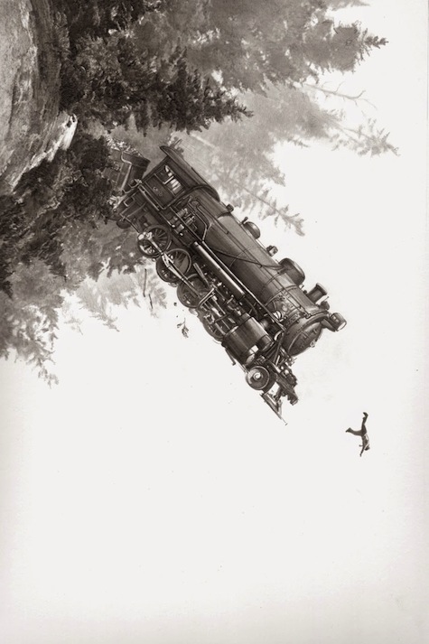
Having come back from Maine where I did a series of Panetoid photographs, I was energized to bring this new series into the piece. It all made sense thematically, it seemed right, even the sketch seemed to confirm we had a good way to go. Easy, right?
Sadly… no. I ended up executing the drawing as sketched—and as you can see it was entirely close to the proposed notion. By every measure this should have been a mechanical process locked and on it sway. It was just about doing it right and I quite liked this as a piece. However… there was something not entirely right about it. The composition I liked, the approach to do something very a-tonal was on track… but nevertheless, it wasn’t working. Looking at it now I can see the focus was wrong. The drawing is well done I suppose, but what was it representing other than my pre-ordained desire to bring those spherical planetoid images into a project? So much of this story is about the boy’s direct experience and fear of the trains that he was certain sought to jump their tracks solely to chase him down. That sense of the story was missing completely here as was any sense of character.
This is a fine piece of drawing, but a book cover can’t just be whatever we want to draw—it has a function to fulfill: it must grab the reader’s attention, be of and about the story without spoiling it. Covers are the frontal face of any narrative, and this first impression is essential. While at the time I didn’t know why, I did know it wasn’t working… so began to wonder what else to do. I stepped away from it for a day or so and let it sit, when of course as usual a new direction came to me late in the middle of the night. I emailed Irene right away before she even had a chance to chime in on this one, warning her off doing so in lieu of this new direction I was certain she’d also prefer. Stay tuned, I said with all the false confidence I could muster.
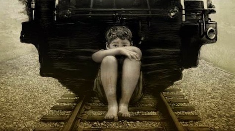
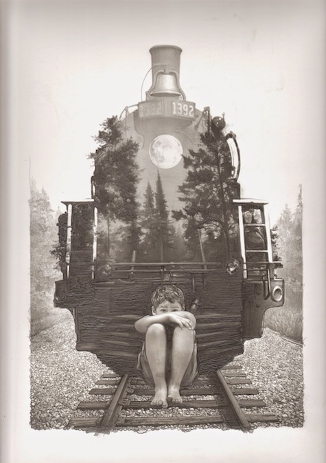
So confident was I in this new approach I jumped full bore into it. Now for the record, these types of graphite drawings are extremely tedious and slower to execute than my usual ink and brush style. And jeez louise… what a self-wounding fool I was to surround this floor of the scene with pebble dash. It literally took me as long to draw all those little rocks, and shade them correctly, as it took to draft the entire rest of the piece. But, I was confident this would work, and never for a moment thought otherwise. The train that was the spooky forest, the moon for its headlight, the boy frightened and hiding on the track, the centralized composition… it had all the singular earmarks of a good and proper cover image.
I wanted to make sure that while I intended to add a bit of color to the final piece, I was committed to make the original drawing as fully rendered as possible, if not entirely. This meant making my brain doing a few pretzel twists to provide the illusory sense of space in the woods and keep to the identifiable form of the train itself, and getting the lightening and chiaroscuro right meant really taking it slow. One of the side benefits was finding that in order to exact the right level of darkness where needed, I had to dig my Blackwing Palomino deep into the thick of the paper, causing small grooves and textures to form. Which of course was a total delight, and I think brings a pressure-printed quality to the original piece as a result. Making the graphite or ink do things it’s not supposed to do is my latest endeavor, and this struck that bell perfectly.
And so it ended up being even more than I had hoped. This moment is something I find rarely occurs with a single image piece like this, and is usually reserved for my comics work. With comics there’s a built in tipping point when all the images are put together and connected with the words or narrative. I never really know what or how the page may work until I see it working, or not. When it does, though, it’s a sheer delight, as if someone else had done it for me and I get to see it for the first time. Single image work like this just lacks the mechanical complexity to bring this moment out regularly, but when it does, it’s pure magic. The sense of space, the setting of the train and woods and most especially making sure to get the boy’s fretful expression correct was the axis upon which this whole thing spun, and it came off nicely. To me, the moment I can look at and appreciate a piece of work as if I were an outsider is a rarely achieved goal. But when it happens, I can see the thing objectively and without ego.
And here’s the thing I discovered at the end: I couldn’t have made this piece without having also fully executed the former go at it. The certainty and wisdom gained from doing it wrong the first time is entirely what informed this final and far more successful piece. Recognizing that sometimes—and in my case apparently all the time—the need to get lost in order to find the way home is the most important take away from all of this. That all failures contain a solution within them is a lesson well learned from this. Also trusting the gut of experience doesn’t hurt either. I can now look back on the original effort and dissect why it wasn’t working, but at the time I couldn’t at all. It simply just felt wrong, and trusting that was the smartest thing I could have done. And I now have two drawings where I would normally have one.
At the end of the day, the struggle to get there fades and you’re just left with what you did or didn’t do. Way I see it I got a bonus piece out of this, and a reconciling with my nature I couldn’t have otherwise achieved. I’m better at what I do and can do for the next job as a result, and by working the previously erroneous method as a vital part of the whole process means I’ll know how to make time for that in the future. We as a species have a total inability to learn from our successes. Our mistakes, though, are an orchestra of learning. Whether it’s a holdover of our survival instincts going back to our monkey times, I can’t say. Somethings are best left as mysteries, even though they are as tangible and valid as any lesson learned.
All images by Greg Ruth. Click any image to enlarge.
The post originally appeared on the Muddy Colors art blog.
Greg Ruth has been working in comics since 1993 and has published work for The New York Times, DC Comics, Paradox Press, Fantagraphics Books, Caliber Comics, Dark Horse Comics and The Matrix. He has shown his paintings in New York, Houston, and Baltimore, and he also exhibited a series of murals at New York’s Grand Central Terminal in 2002.


